Here’s our app design checklist:
- Design a user-flow for each screen;
- Draw screenshots (wireframes);
- Choose suitable patterns and color palettes;
- Create prototypes and design (mock-ups);
- Build an interactive prototype of the application and ask people to rate it and give feedback;
- Do the final touch-up of the prototype, polish all the screens so that they are all ready for development.
Let’s start!
User-Flow
The first step is to figure out what features are needed in the application. Once you have decided, create a user-flow – a flowchart of your application.
Usually user-flow consists of three types of shapes:
- Rectangles are used to represent screens;
- Diamonds – used for conditions (for example, pressing the login button, swiping left, zooming in);
- Arrows – connect screens and conditions together.
User-flows are very useful because they provide a logical idea of how the application should work and solve the problem.
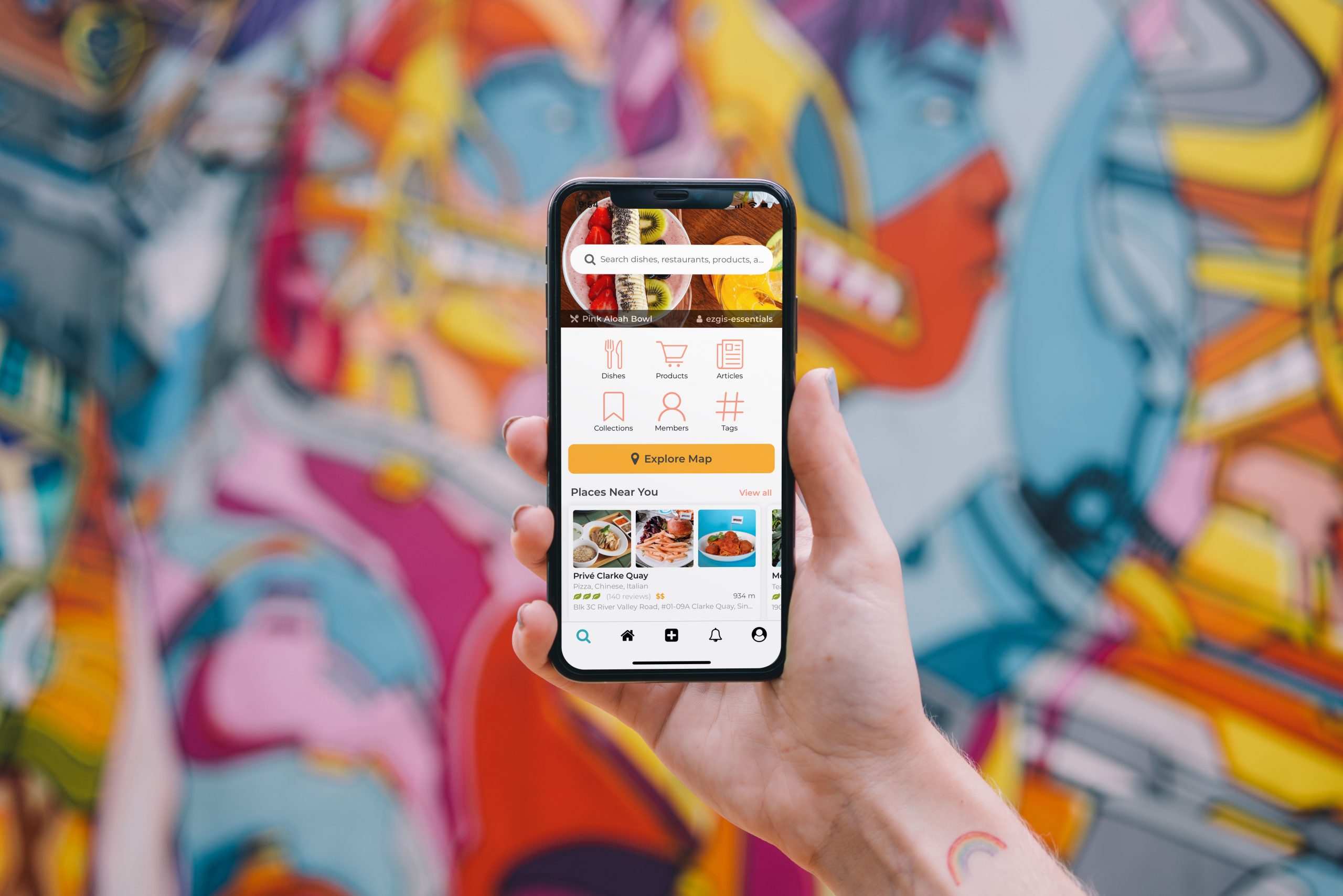
Wireframes
After you have completed designing the user-flow for all scenarios, you begin to sketch out all the screens. Wireframes are essentially quick sketches of your application. A sketch, a diagram of where the images, labels, buttons, and more will be located. This is a rough sketch of how your application should work.
Text
The text of the main story should be readable. Since the mobile screen is much smaller than the desktop one (especially when it comes to smartphones), it seems logical to reduce the font, however, it is better to keep the same font size as on the desktop version. You can focus on the size above 16 points, the font itself must be legible. On the other hand, headings, quotes, and sidebars should be reduced in size so that lines are without hyphenation and long words, for example, “attractions”, are placed in them. It is also important that the accent elements are contrasting concerning the main text – for this, in addition to the size, you can use other techniques: boldness, color, composition.
In some cases, site templates automatically resize headings based on the width of the screen. If you can set these parameters manually, always take the time to customize the fonts. Examples of fonts that look good on mobile: Open Sans, PT Sans, PT Serif, Me.
Navigation
An important parameter in mobile design is navigation, which must be intuitive. The scenarios that everyone is used to in interfaces should also be considered in the design of the content. For example, any smartphone user is used to swiping left and right – no one will click on the little arrows to scroll through photos.